Sunday, June 19, 2016

Stampendous Melt Media Embossing

I saw this gorgeous creation on the Stampendous blog:

Amazing, right? So I read the tutorial, watched the video and tried to adapt it.  I wanted to make a title for my beach album.  I bought all the stuff: embossing powders, the teflon craft sheet, deep impressions embossing enamel....


I cut out BEACH using the Life's a Beach cartridge.  I had a little trouble using a thicker chipboard and it took several tries and adjustments but I managed to cut them at 3.25.  I stamped them with versamark...:


sprinkled them with the embossing enamel (my grandfather was a dumpster diver, and he saved all sorts of useful things from the trash.  I have over a hundred of these plastic take out covers and they make great, disposable trays for messy projects)....


I placed them on the teflon sheet in a frying pan and covered them, as I'd seen Fran do...


they liquified beautifully! I sprinkled on the colored embossing powders from the beach pack and tried to smear and blend and then it all fell apart.  Getting them off was so hard, they stuck to each other and as I tried to pull, the embossing powders were sliding out of place.


I was able to warm them back up and get separate letters but they were no where near as nice as I had been hoping for.  In the process, I burnt myself twice, once touching the pan and once when a blob of hot embossing powder stuck to my finger.


I saved the scraps and some of them blended the way I wanted my letters to blend.  The big pieces peeled easily off the teflon mat and I scraped the little ones off with a Pampered Chef scraper.


A little blob of enamel melted on the teflon sheet and I think it'd make a great dew drop on some future project.


So it was time for trial number two.  I figured my problem was I had too many edges, as the tutorial was done with one big, round piece.  So I used my Gypsy and linked the letters in BEACH to form a connected word.  I made them a little bigger, too, about 4 inches, and used a lighter chipboard and they cut nicely.


I inked them up with the versamark and sprinkled with the embossing enamel and found a new problem...


they didn't quite fit in my frying pan!  I had to angle it to get it in my electric fry pan.  I repeated the embossing process and added some of my scraps, was a little more generous with the blending and swirling.


I even added extra sand and didn't blend it all the way for a more realistic, sandy beach look.  It's not perfect but I think it'll make a great title for my beach album.

So for next time, I will not try to do letters!   I will not be afraid to blend.  I will add in more leftover pieces that melt nicely on the teflon mat.  And I will be careful not to burn myself!

Sunday, April 24, 2016

Gingerbread House Layout

I put together another Mosaic Moments style layout.  I used this pattern for inspiration:


The background papers came from this cute stack from Michaels:


I cut the gingerbread house from Create a Critter 2 and the letters at 0.75 from Nate's ABCs. Here's the left side:


The journaling was printed on Recollections ink jet printable glitter paper, also from Michaels.
And here's the right side:


I tweaked the pattern a little on this side to better fit my photos.  And to add more photos, I layered them on the left side, bottom left corner:


That way I got three in one!  Usually, to layer like this, I use the flip flaps from CTMH, but as the photos were an off size to fit the Mosaic Moments pattern, that wouldn't work.  I just used a folded piece of cardstock in between the photos.

Saturday, April 9, 2016

Mosaic Moments Layouts

Mosaic Moments Layouts

I felt like my pages all were laid out the same and I was browsing Pinterest for new ideas and found the Mosaic Moments system-clean, simple, and you can fit a ton of pictures on one layout.  So I bought the dies and made this: 


I used papers from Stampin Up (Delicate Dots and Flirtatious, with the coordinating solids) and cut accents from the Cricut New Arrival cart.  The letters are from Jasmine.

Sunday, May 17, 2015

Dino Play Birthday Layout

Here's a layout from 2008 that I just completed last week.  I used the Dino Play Cricut Lite cart, which I bought specifically for this layout.  As usual, I double-layered for dimension.  The background paper is from a DCWV Birthday stack, solid cardstock is Stampin Up.


Sunday, April 5, 2015

Easter Layout

Happy Easter!  Here's a layout from way back in 2007:

The background paper is from a DCWV stack, the cardstock my usual mix of CM and SU.


I cut Elmo from the Elmo and Friend's Holiday cart. I used suede paper to give him some monster fur so he's nice and fuzzy.  His tail is a small cotton ball cut in half.


I double-layered the egg and used it for hidden journaling by attaching the top with a brad so it swings open.
the egg came from Create a Critter.


Close up of the left hand side.  The title came from the Elmo cart, too.


Close up of the right, with both eggs.


As always, thanks for looking.

Saturday, June 21, 2014

Girl Scout Camp HTV

Yes, yet MORE HTV!  A few weekends ago, I was asked to help chaperone a girl scout camp sleepover, even though my daughter is not a girl scout.  Or, at least, she wasn't!  She had such a great time that she has joined the troop.  She really loves it and it's a great organization, I was just trying to limit the number of activities we are involved it, but oh, well!  So the original plan was for the girl scouts to decorate their own t-shirts, which I think is a great idea.  But then, after seeing the field trip shirts I made, they asked if I would mind doing camp-themed ones.  We were going to go with simple and easy until we looked at the Campin Critters cart.  Those critters are adorable!

The scouts supplied all the t-shirts and vinyl.  Each shirt had some flock on it somewhere.  I used the left over jewels from making the field trip shirts for eyes.  Just a warning-the jewels come off very easily.

 This one was my daughter's.  The black of the prorcupine is flock and she picked pink jewelled eyes.  I cut off the the marshmallow stick from the bottom, black layer so I wouldn't have to try to layer the brown and then white over it.  He was cut at 5.5 inches.  Some of the images I did the reverse-cut and some I didn't, since in most cases it didn't matter which way the animal was facing.
The troop leader's daughter picked the skunk coming out of the outhouse, with the little toilet paper stuck to his foot.  He's so cute.  His white stripe is flock.
 I personally loved the frog spraying bugspray.  I made the little flock flocked, as frogs aren't fuzzy.
 Here we have a fuzzy white rabbit in her sleeping bag.
 Big foot!  All the dark brown cut as one piece so the treads of his shoes are fuzzy, too.
I also love the squirrel reading by the lantern light.  Here, too, I trimmed off the bottom layer that would have just been covered by other colors.
 The duck's green head is fuzzy.
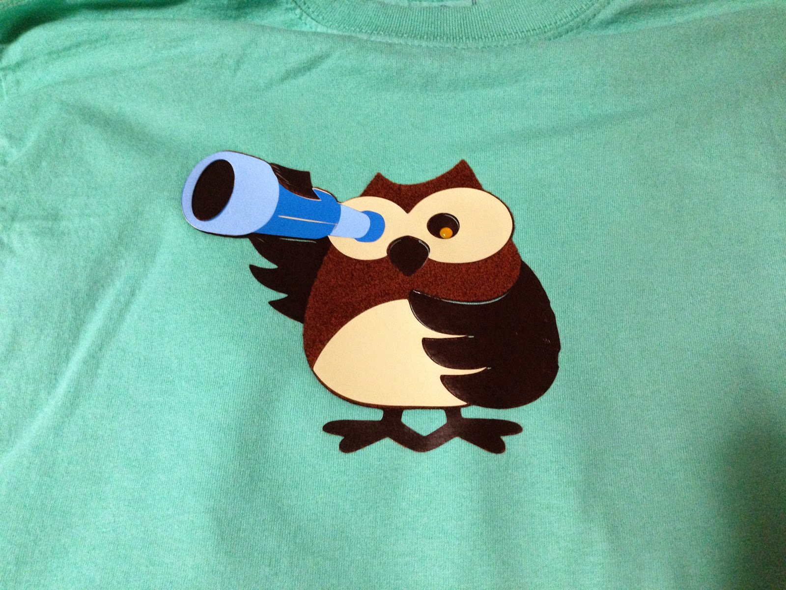
 The brown on the owl is his fuzzy part.
 Here's our forest ranger for one of the chaperones.
 How perfect is this eagle scout?!  We made him for the troop leader.  His white is fuzzy, which means some of his badges are fuzzy, but I wasn't going to be particular.
 I forgot to put fuzz on the snake but luckily he was for a chaperone, who wasn't upset by the oversight.  She said, "Snakes aren't fuzzy anyway."  My daughter, though, chided that I should have at least added fuzz to his hat or bandana.
 Since I was the resident nurse, I got the medical cardinal.  I love her!  The black face is her fuzz.
 A walking moose with a girly pink and purple backpack.  His brown is fuzzy.
The fox was a special request and he's made with red flock.
The bat with the compass to navigate his flight is another of my favorites.  His flock is the black part.
Last but not least we have a grey-flocked wolf calling the other critters to dinner.
 
 
I think Campin Critters is one of the cutest carts ever.  I can't wait to make the scrapbook pages from our camp out.  They'll perfctly match the shirts!  As always, thanks for looking.


Saturday, May 24, 2014

I'm the Director HTV

One of the teachers at my daughter's school asked me if I could make a t-shirt for the birthday of one of the other teachers.  The birthday teacher directs the fourth grade play, so she wanted it to say,"I'm the director, that's why," and maybe have a picture.  I suggested the clapboard from Movie Night.  She picked the fonts and colors, bought the shirt and I made it.

The shirt was a cotton/rayon blend so at first I had the iron set too low and the vinyl wouldn't stick.  Once I turned it up, it was fine.  The vinyl was all siser easyweed.

 
I love the way it came out!  'I'm', 'the', 'that's' and 'why' were cut from Cuttin Up Short Stack at 1.25 inches out of black.  'Director' was the Curtain Call font from Art Deco, with black layered over grey, at 1.5 inches.  The clapboard came from the digital Movie Night cart and was cut at 3.3 inches.  Remember to reverse any words so that they will read correctly.
 
Thanks for looking!