Saturday, July 14, 2012

More Heat Transfer Vinyl

   I haven't had much time to scrap (don't I always say that?) but I had to make some t shirts.  My daughter's class took a field trip to the seacoast and I used Life's a Beach to put a different sea creature on each child's shirt.  The animals on LAB are cute and kid friendly.  I didn't get any pictures that don't have other people's kids in them, though.
   My mother is a hygienist and one of her bosses just had a baby girl.  The office bought a gift, but she wanted something personal and inexpensive so I made her a onesie.  I used Siser easy weed and a sparkly pink HTV that surprisingly cut very easily.  I think the lettering was from Winter Woodland (but it could be Nursery Rhymes) and the tooth fairy is from A Child's Year.

 Then I had to make a pj top for my daughter's teacher, who is crazy/dedicated enough to have her entire class sleep over at the school as an end of the year treat.  The kids looked forward to it all year and had so much fun.  One of the highlights was that she let them have a can of soda!  I did the lettering from Making the Grade and the sleep mask and soda came from Chore Chart.  I had two types of vinyl-the Siser easy weed, which is by the far the easiest to work with, and another brand I don't remember that doesn't layer as nicely.  That's why the circle under my soda bottle isn't perfect.
 Lastly, my niece loves dogs and has a dog themed party almost every year.  I used the little dalmation from Create a Critter, then put a Doodlecharms party hat on him instead of the fire hat.  She loved him.


Tuesday, November 22, 2011

Pirate and princess party invites

I had great plans for the invitations but hardly any time, so I ended up simplifying a great deal.  Okie from the cricut messageboard gave me a link to a great site where you can search for fonts by theme and I found just what I wanted (thanks Okie!).  The Pirate invite was cut from Life's a Party and the Princess from Once Upon a Princess.  Fonts were Treasure Map Deadhand and Precious.  I tried to make the wording a little fun and got a few comments, so I think I succeeded.  I added things like "pirate hideout" for our address and "ArrrrSVP" and "have your coachmen drive you to..."


Sunday, November 20, 2011

Pirate and Princess Seventh Birthday

My daughter turned seven and, even though after last year's exhausting birthday celebration my husband and I swore we'd never have another party at home, we had a Pirates and Princess Party.  I think I was more excited about the theme than my daughter was!  She had attended a luau party over the summer and wanted that as her theme, but I convinced her that a luau theme would be fun at any age but a Pirate and Princess would be perfect for now.  I had a lot of plans involving my cricut, vinyl and gemstones but, between work, school and other commitments, time got away from me.  But I love the way the things I did find the time to do came out!

I had seen other people use shrinky dink film to make all sorts of things, and so I wanted to make these wine charms so the kids could keep their cups straight.  I wasn't serving wine, of course, but I found awesomely appropriate goblets at Oriental Trading Company.  I used my black cricut pen to draw the skull and crossbones from Life's a Party, at 2.5 in, then went back over it and cut it out.  I used the deep cut blade and multi cut 2 and they cut perfectly.  The tag is an old sizzix die and I just wrote the names in sharpie.  I baked them according to package directions and they came out perfect!  The beads and holder came from Oriental Trading and I used frosted instead of clear shrinky dink film from grafix arts, I think.
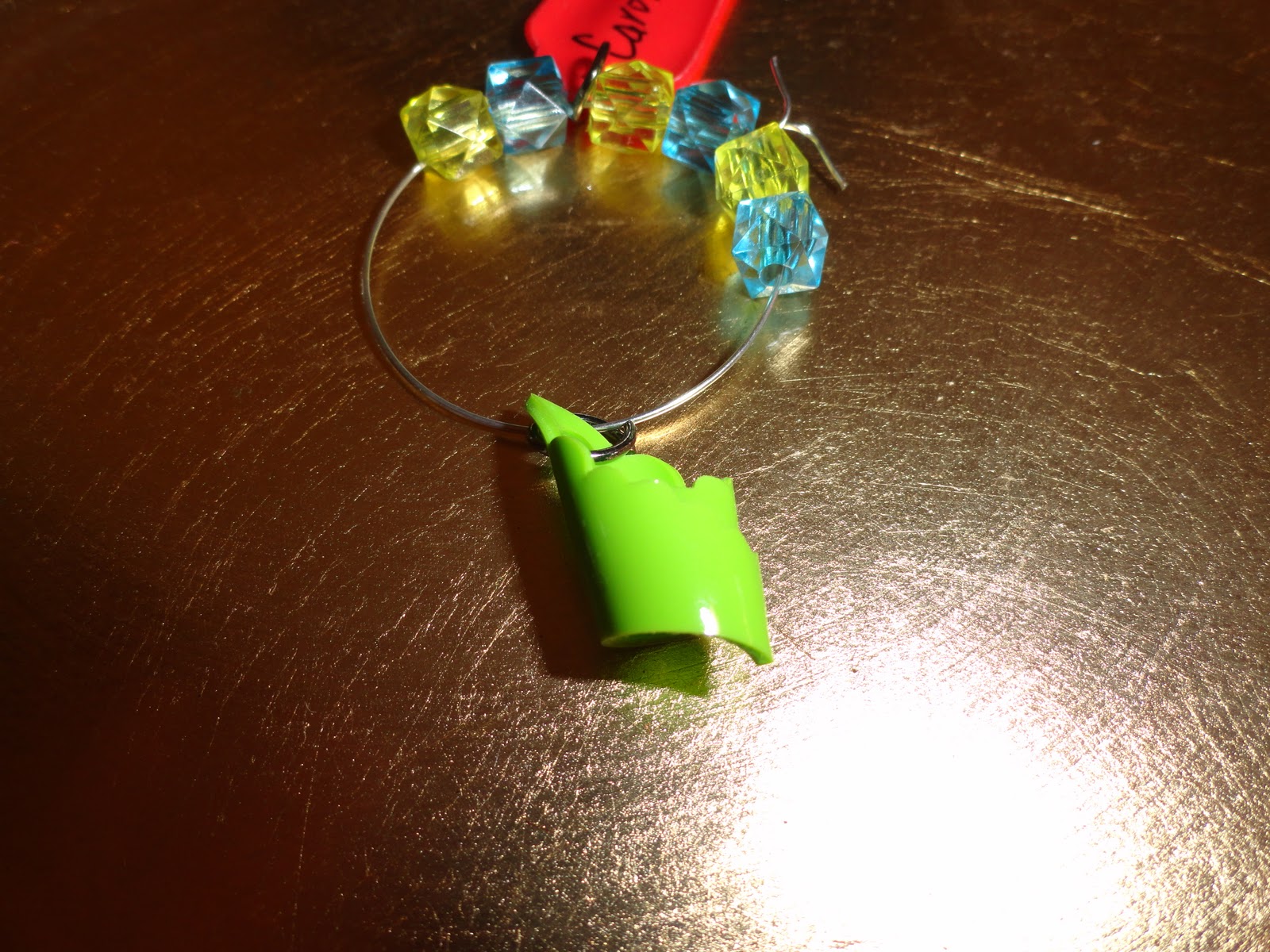
 The girls charms turned out a bit trickier.  I used colored shrinky dink film and found it a lot harder to work with.  I needed to multi cut 3 times instead of 2 and sometimes I still had to make a cut with scissors here or there.  The crowns came from Storybook and the first one in the picture below kept curling.  Out of six, I had only 2 that weren't folded over on themselves.
 So I tried switching to a less intricate crown, and it, too, curled and wouldn't uncurl.  I ended up using them curled and firguring it gave them a more 3D crown look.

 The purple one is the "before" baking and the green the after.  The tags, too, would not lay flat, event though they were the same cut as the frosted and the frosted ones curled, then uncurled like the package claims they will. 


I don't know why this picture is flipping, but these are the goblets with the charms on them.  They were a big hit!  The only problem was that the princess goblets came in a pack of 12, half with pink gems and the other half blue and of course all the girls wanted pink.
Thanks for looking, I'll post more party picts soon!

Saturday, September 10, 2011

2nd Birthday Pages

I am still finishing up 2006, I just have a little bit of November and December to go.  I am working on the pages in my new scrapbook room. Yeah!  I finally convinced my husband we needed a space for my supplies more than a bed for the infrequent company we have.  I love, love, love it.  I didn't paint the walls, I was too impatient to put my stuff in there.  Some days, I just go sit and look around!  I realized I have too much stuff and I am sorting through the things I have never used and making room.  When it's a little cleaner, I'll take some pictures.
So here is the 2 page spread for my daughter's second birthday party.
 Left side: background is from doodlebug designs, party time was cut from Life's A Party
 Right side: background is doodlebug designs, all cardstock is SU and CM
 Simply Charmed is an adorable cartridge, in my opinion, especially for little kid themes.  The cupcake, birthday party hat, balloon and present with the happy smily faces are all from SC.


Saturday, August 13, 2011

Beech Hill Farm Layout

I made this one for the Cricut Circle monthly contest and I had so much fun!  I got carried away with the inking and cuttlebug embossing.  The theme of the challenge was to make a background.  Now, I want to make more backgrounds (I am thinking of a Halloween scene....)

Anyway, here it is:


The hills with trees were cut from Pop Up Neighborhood.  I tweaked them a little with my gypsy so they'd stretch across the whole page.  The hill is SU Mellow Moss.  The dry grass along the bottom I hand cut from DCWV Safari stack paper. 

 These trees are SU Old Olive paper. I ran them though the Divine Swirls CB Folder than used the matching ink to highlight them.
These trees are SU Always Artichoke run through the Herringbone folder and adhered with pop dots for dimension.


The sun and moon combo came from Pop Up Neighborhood, as well.  I swirled a little SU Summer Sun ink over the sun and a little SU Bashful Blue over the cloud, after the cloud was put through the CB with the Divine Swirls folder.
I cut the rocks from Old West and used DCWV photo real paper. I used a lot of foam tape and layered the rocks, then added grass cut from Zooballoo in between the rock layers. The colors were Old Olive and Always Artichoke again.


The barn and gate were cut from Old West.  For the gate I used the fiskars wood grain embossing plate.  I inked it with SU Basic Brown and the paper is CM brown.  The barn was "weathered" with ink and even my husband noticed.  The sheep came from My World and he was covered with flock so he is good and woolly!
I cut open the barn doors and added a picture.  After I taped it all down, my daughter said I should have cut the window in the barn and put a chicken.  She's got some good ideas!

Thanks for looking!

Friday, August 12, 2011

Contemporary Resort

This week's Circle challenge is to scrap some vacations photos and I am sitting on over a thousand photos from Disney.  I had such high hopes of getting lots of scrapping done this summer but I've been so busy (and so distracted by the cricut messageboard!) that I haven't gotten much accomplished at all.  The challenges really help me buckle down and get some crafting done.

So here are the photos I took around our hotel.  We were lucky enough to get a free upgrade to a deluxe level.  It was really a beautiful hotel.

I had a bunch of pictures, none really good enough to carry the page, and I didn't want more than one double-page spread of hotel photos.  But I still needed room for journaling, so I hid it behind my photos!
The background paper is from Stampin Up's retired Candy Lane paper pack.  It's Riding Hood Red with a tone-on-tone print that doesn't compete with the photos for attention.  I opted not to mount them in order to conserve space.  I made the title from Recollections silver metallic paper because of all the silver and chrome of the Contemporary itself.  The letters are from Plantin Schoolbook and I partially welded them with the gypsy.  Not every letter connects but I didn't want them to seem squished, I just wanted them to be easy to glue!  I added Mickey hats off the Mickey and Friends Cart, cut at 1.5 inches.  I cut four more for my journaling tabs and glued them on either side of the journaling box.  Had I thought of it earlier, I could have welded them with my gypsy. I added Mickey hat borders, also cut at 1.5 inches from M&F.  Mickey's head actually came from the Mickey Font cart, cut at 3 inches.  I cut two of the black base layer because I always pop dot the nose, so I just cut it off the base layer.  I printed "welcome home," the Contemporary catch phrase, in waltograph from my computer then cut a conversation bubble from the Batman cart around it.  With the E2, you can see exactly where your cut will be on the mat and so it is super easy to place the words where you want them!  I also could have used center point but I am not sure how to do that on the E2 and I was too lazy to look it up.

Also, for anyone who has seen some of my previous posts, I have finally convinced my husband we don't need a guest rom and I will be converting it to my scrap space this weekend! 

Tuesday, July 26, 2011

Backyard Picnic

I'm scrapping pictures from 2007, only four years behind!  I can't believe how little the girls are in these shots. I wanted to fit a lot of pictures, so I kept the embellishments simple.
The font is from Birthday Bash, at 1.5.  I accidently left real dial size on, so they aren't proportional to each other, but I wanted this layout to be fun and focus on the kids, so I didn't worry about it.

 The sun and popsicle are from Simply Charmed.  I love that cart!  It's so cheery and that perfectly captured the feel of our backyard picnics.  I chalked the cheeks on the sun and the popsicle was too dark for chalk so I used a copic marker to accent.
The background paper is from an old DCWV summer stack.